Studio Styling

Gramercy Bed Fave

I recently staged an apartment for sale, transforming a studio on Gramercy Park into the kind of place I’d like to live.  Over the course of two weekends, I moved in some favorite pieces of furniture, then layered in “life” with new accessories and pieces I’ve collected over the years.  By the end of it, I converted a once-disheveled bachelor pad back into an airy space for one.

This space also happens to be my old apartment – my first – purchased over a decade ago, as a youngin who knew little about real estate (and less about co-ops).  While living there, I tried my hand at renovating, redoing the kitchen (Dad, your backsplash is still lookin’ good!) and made other updates with storage solutions and new lighting.  The space suit me well for many years, teaching me in my 20s and 30s about living simply, minimalistically, in 450 square-feet.  

Gramercy Console - Cropped 3

Now that I’ve spent a few days converting it into a “listing”, part of me wants to move back in.  It’s not necessarily because of the neighborhood charm or the space itself, but because of how I felt the day I completed the task, after hours of styling, steaming, arranging, and photographing.  Letting myself sprawl out under the ceiling fan, legs aching, I looked around and felt proud of the results, a ruthlessly edited mixture of some of my favorite things.

But the added bonus was what I didn’t see:  there was no clutter, no mail to open, no to-do lists, no TV to turn on, not even a good music option.  And how freeing!  I popped open a cookbook and let my mind drift, less focused on to do lists, obligations, worries, and more focused on good memories from my time there, what I had to let go of, what I hoped for the future, and where I was.  Turns out that paring down and getting rid of visual clutter allowed me to get rid of mental clutter and be more mindful.

To be clear: I am not a minimalist.  I like my things too much: my book, my old photos, my peep-toe heels from another life, my seltzer bottles collected from near and far.  But I’ve gained a better understanding of the power of eliminating the other “stuff” that can sap my energy, and allow space for more joy to creep in.  I haven’t read Marie Kondo’s book, but I have a feeling this was part of her gist.

I suppose that’s at the core of what I’m doing now, letting go of certain things, whether big (an apartment) or small.  It’ll make space for whatever is to come.  Freeing, indeed.

Gramercy Bedside 1

Starts & Finishes

Hardware newI have a habit of starting many things at once.  Case in point: the 8 books on my nightstand at varying stages of doneness.

It’s not that I don’t finish them (I do), or that I become disinterested (I don’t).  It’s just that there are many things I want to get my hands into: things to paint! plants to plant! And I want to start all of it now.

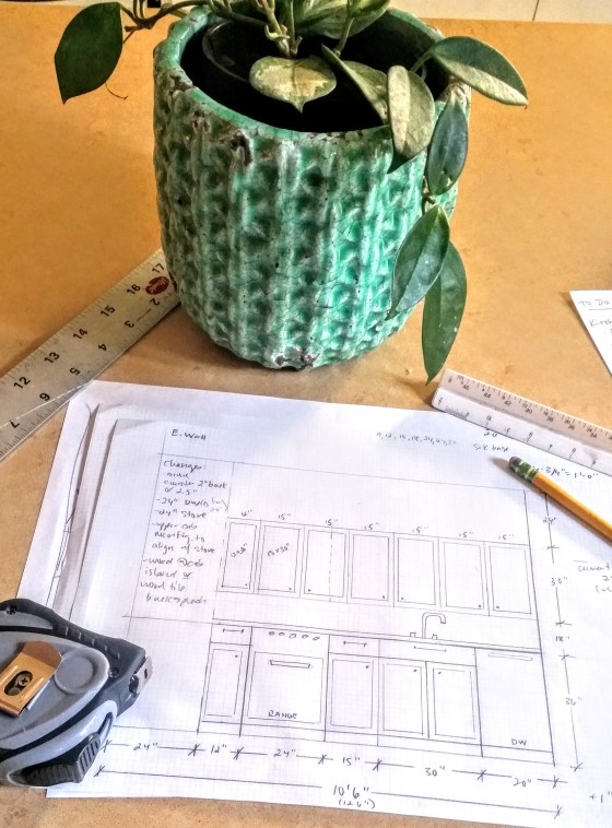
One of these was a kitchen renovation I took on last year.  While I didn’t do anything structural, it was pretty involved, and it’s still only about 85% done.  (Did I paint the lower cabinets gray yet? Nope. Will I? Maybe). And I’ve been beating myself up over the fact that it’s not done, focused on the list of to-do’s to get me there.  

That’s something I’ve always grappled with:  the list mentality that goes along with any project.  Too often I’ve caught myself thinking “I must finish XYZ and check these tasks off before I can relax.”  

But I’m learning to be in the moment and focus on the “process of doing”, not just the end result.  Chalk it up to making bigger life changes or a heightened awareness of the swift passage of time (yikes).  I’m trying to be mindful of where I am this minute – instead of focusing on some imaginary finish line.

As it turns out, most tasks in this reno have been a blast:  picking finishes, accessorizing, styling.  Paying attention to these smaller moments is where the magic is (in kitchens, and in life).  So that’s where I am, enjoying the decisions I’ve made, big and small, that have made this space mine.

Some highlights below:
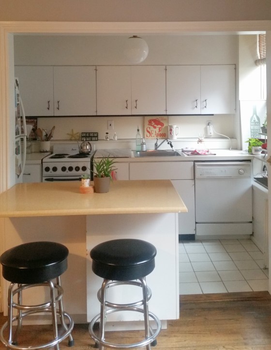
1. The FloorsFloor 1Ah yes, my heavy-duty, smooth and buttery encaustic clay tile floor.  It may be a favorite element, and what likely made this project stretch on for months vs. weeks (it took me awhile to choose a pattern).

The motif is baked into the top clay layer, so after years of wear, the pattern won’t wear away.   I chose the Atlas II from Cement Tile Shop because it feels part farmhouse, part modern.  The charcoal and milk colorway paired with a white grout imparts a faded-out look at the seams that I love.
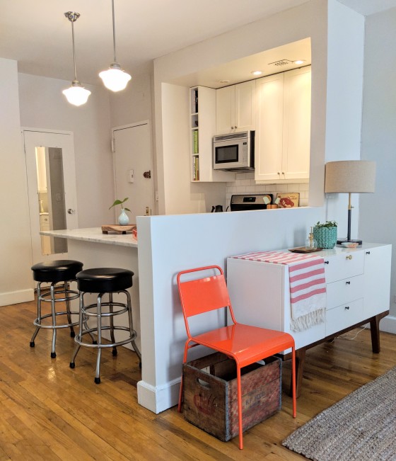
2. Area RugMaker:S,Date:2017-10-20,Ver:6,Lens:Kan03,Act:Lar02,E-Y

This guy!  $30 at Urban Outfitters.  Every space needs a black accent for drama and depth.  This also hides all manner of spills and sins.
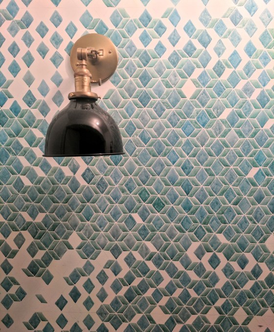
3.  Backsplash Tile

Speaking of, I was drawn to this ceramic tile because I was wanted a clean and minimal graphic like subway tile, but a bit more unique.  This 2″ hexagon from Home Depot is a nod to the asphalt blocks I see on my runs (walks?) along the Brooklyn Promenade, a little something inspired by the neighborhood.
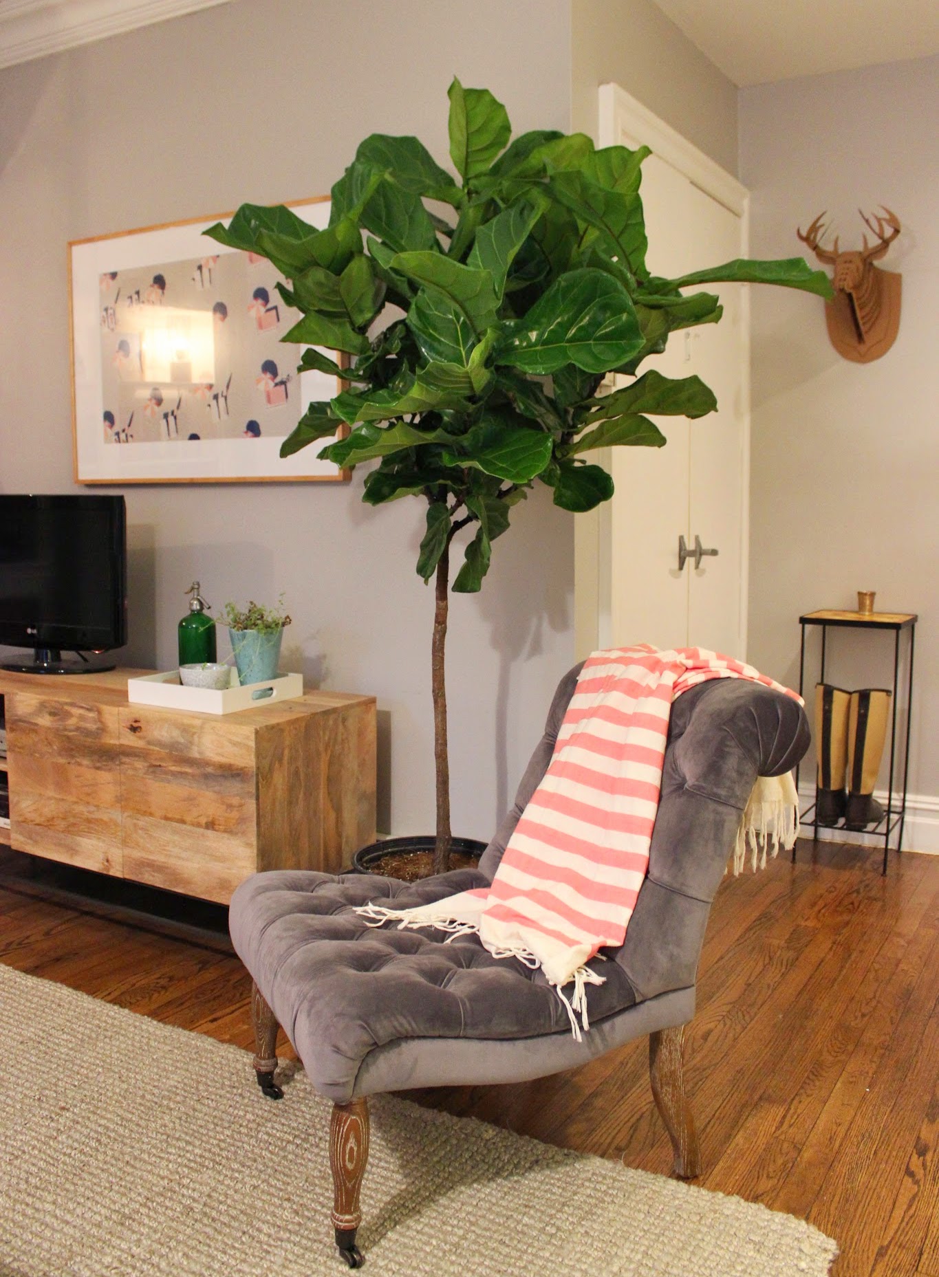
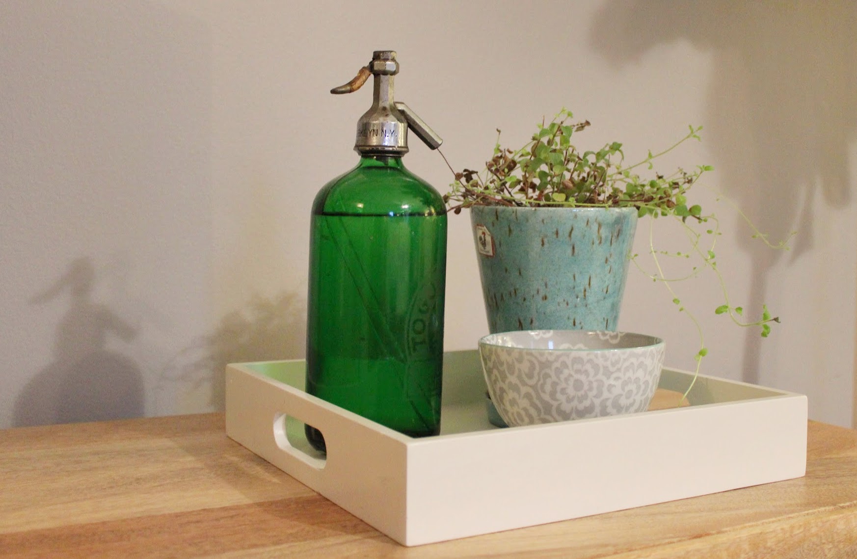
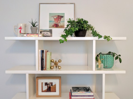
4.  Greenery

Plants simply bring  warmth to a space in my opinion.  Succulents are nice on kitchen counters because they’re tight and their leafiness won’t get in the way of cooking.  And brightly colored planters allow for a color scheme that can change with the seasons.Maker:S,Date:2017-10-20,Ver:6,Lens:Kan03,Act:Lar02,E-Y

5.  Hardware

This is where I got to add some “jewelry” to my design.  I chose the simple dimpled Mid-Century Knob for the cabinets, and the squared-off Greenwood Pull for the drawers, both from Schoolhouse Electric.  I love that they’re handmade in the US from recycled brass.  The faucet is the Trinsic in champagne bronze from Delta, but the “wet bar” version, which works better in smaller spaces.  It’s also quote sexy for something rated so highly for longevity and functionality (note: it is totally normal to rank the sex appeal of a faucet).

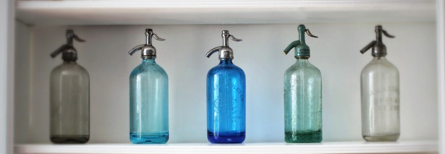
6.  Accents / Kitsch / Doo-dads

Keeping in line with the brass, I added some character with a few small brass accents.  I know the brass trend may have peaked, but I personally cannot get enough of it. You could say these additions speak to two of my favorite kitchen activities:  crafting cocktails and popping open a brew. Maker:S,Date:2017-10-20,Ver:6,Lens:Kan03,Act:Lar02,E-Y 
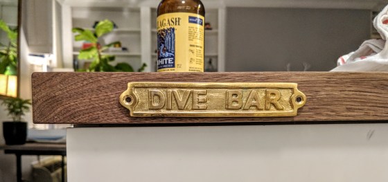
The plaque is from a road trip to that took me and a few friends through Malibu a few years ago.  I may mount it on the island to make a real “I’m on a ship!” statement, but for now it rests in a book nook.

7. Custom Grill

Alright, last brass thing (promise).  This custom grill covers a non-functionining heater and replaces and old, heavy steel grate.  This picks up on some of the graphic qualities of the floor but in an old-school Grecian pattern.

Grill

8.  Wood Elements – utensil holder, cutting boards, countertops

To balance some of the stark white and harder surfaces like the white wood cabinets and Caesarstone countertops, I used a 2″ thick walnut for the island surface, and echoed the finish in the form of a teak utensil holder and natural wood cutting boards.  The cutting boards are in constant rotation and do double-duty, covering the electrical sockets when not in use.


So, this is all she wrote for now, the highlights from a journey still in progress.  There could be more updates coming your way in the form of new accessories and details, but hopefully I’ll be too busying enjoying them to report back.

RESOURCES:

UrbanOutfitters – area rug

Anthropologie – planter

Whisk – teak utensil holder

Malibu Farm – brass plaque

Delta – sink faucet

ArchGrille – custom grill

Schoolhouse Electric – cabinet hardware

Home Depot – Merola Hexagon Tile

Cement Tile Shop – floor tiles

PH Architectural Woodworks –  all custom cabinetry and millwork

Order + Disorder: A Love Story

Painting Patterns
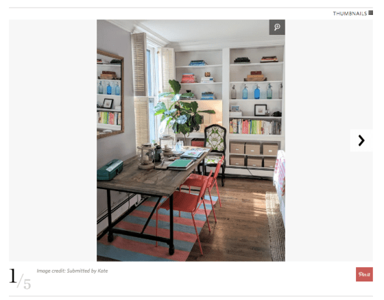
Earlier this year, I embarked on a kitchen refresh that’s become lengthier than projected (read: it’s just now wrapping up).  A cabinetry and appliance swap-out morphed into months of living in limbo amidst plaster dust, taped floors and washing dishes in my bathroom sink.

And I’ve struggled with it.

The has question nagged:  how can I keep a sense of order while living in disorder?  I like structure and I crave organization.  (Just ask my mother; apparently as a kid, I couldn’t start my homework until my room was spotless).

The experience has been an exercise in flexibility to say the least, letting things go and being at peace in the moment.  That being said:  sitting around waiting isn’t my style.
Closet BlankEnter new project: my 2nd bedroom closet.  What once housed Christmas decor, class projects and suitcases is being transformed into a desk nook ready for writing and designing.

So far the essentials are in place:  my contractor blew out the interior, my millworker PHAW fabricated an oak desk to provide lots of workspace, and I’ve installed sconces from Schoolhouse Electric for a classic look. But the white walls begged for some visual interest, so I committed to doing an accent wall, something I’ve thought about for years.

To plan, I pulled inspiration from everywhere: wallpapers, tile patterns, furniture.  I wanted a bold geometric look, which can done in a small space with little risk.  Inspo 3But I wanted it to be all mine, original.  So I sketched some patterns and opted for a triangular geometric repeat, which I eventually transferred onto the wall (about a gazillion times?) via a stencil I made from scratch (scroll for more details).

Once the wall was fully covered with my pattern, I got down to the business of painting, filling in each geometric shape with varying mixtures of greens and blues and teals, diluting the acrylics with enough water to mimic the look of watercolor.

At this point, my sanity was surely in question.  But the whole thing was a blast.  As I progressed, I got lost in the painting – in a good way – not thinking about the outcome, but enjoying the way the paint soaked into the flat white walls.  My mind could wander as I focused on the task, distracting me from whatever was ailing me that day:  heartbreak, self-doubt, you name it; this proved a perfect antidote.

I was suddenly a 14th century frescoe painter, feeling what they must have felt placing watery paint on chalky plaster.  And then a flash of connection to my grandmother, who painted ceramics for years.  I now understood the satisfaction she had putting paint on blank figures all those years in her quaint little kitchen.

As I worked to fill each tiny shape, the paint dried to a finish beyond my power.  While my pattern itself was rigid and controlled, inside each shape lie a bit of crazy, a little bit of kismet: fate determined how each stroke would dry.

Turns out, my wall is a little bit controlled, and a little bit wild.  Like me.  The two can indeed coexist, and that can be a beautiful thing.

For more scoop on the step-by-step, see below.  lastpic
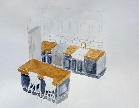
1 – Gather inspiration.  See above!

2 – Pattern development.  To get started, I sketched out simple grids, experimenting with repeats and ratios, using my ruler and triangles. I opted for a 1.5″ x 2″ repeat.  You get the drift.  #mathWall Sketch 1

3 – Paint Testing.  I played around with acrylics on poster board that I could place in the closet to stare at for a few weeks.  Mostly so I could nail the blue-to-green color ratios.  BUT also so I could stall.

Standing Desk

Makeshift art table!

When I had a good pattern going, I photographed it and drew up a mock in Photoshop.  (Can you see how far I got in Photoshop class?) It gave me the green light to move forward.Wall with watercolor pattern
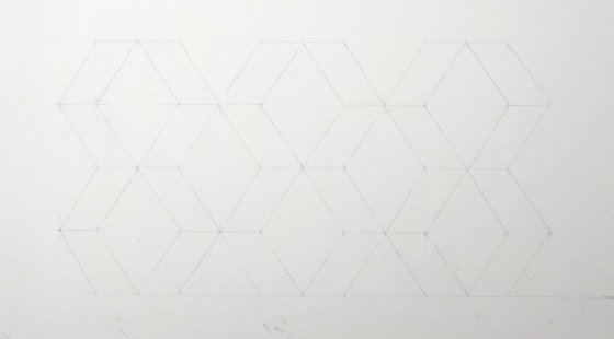
4 – Stencil creation & application.  I transferred my finalized pattern onto a blank plastic stencil sheet.  I then cut out key lines in the pattern with a straightedge (without cutting all the way through at the ends of each shape).  I taped it to the wall and traced  until the wall was filled.  Tip:  A long level is key here each time you tape up the stencil).  Stencil 1
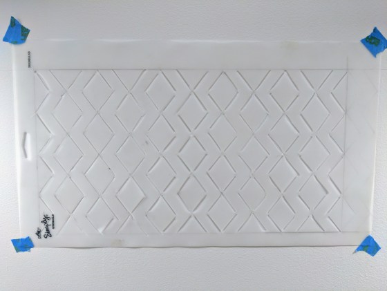
5 – Painting.  I put “paint to wall” in an inconspicious place to see how things would look.   Using the inexpensive acrylics was somewhat freeing, as I didn’t worry too much about messing up – and they also mimix the look of watercolor when mixed with enough water.

The final result?  If only I had one!  Stay tuned…

Buy the Ticket, Take the Ride

Crazy eyesThis is me, circa last day of work (note the last-day crazy-eyes).  But more on that in a bit.

You could say I bought my ticket 8 years ago when I started taking interior design classes.  Sneaking out of my magazine job to head uptown to class, I’d perspire heavily on the 6 train, hoping equally that 1) no one saw me leave work at 5:30, and 2) I’d make it there on time.

It’s funny I used the word “sneak.” I don’t think anyone really cared what I was doing, but I did feel the need to hide my creative side back then out of fear that people would think I couldn’t devote myself fully to work and pursue something on the side.

But over time, things shifted. Perhaps I’ve become more open with sharing that other side.  I owe part of it to working for Google, a company that encourages its people to nurture their side gigs and fly their freak flags.  But I owe some of it to my own awareness, tuning in to the passage of time, aging and my own authenticity.

This has all shone a light on how I spend my time. And I’m not talking about spare time per se; I’ve already tackled the matter of making sure I have it and spend it wisely.   I’m talking about those workday hours that tick by between 9-5, those hours of life we’re told – at least my generation – to make a living.

G View

View from the Goog

Aren’t those equally precious?  Mine have served me well, especially after 6 years at a company that’s made me feel appreciated and rewarded, alongside some of the best people ever.  But I’ve had a nagging feeling that my creative side work was ready for its time.

SO!
I left my job.

I’m now an intern at an interior design firm here in the city.  With a month under my belt, it’s been exciting, humbling, rewarding and overwhelming at once. I walk out at night tired and spent, but happy.

I’ve found there’s a sense of feeling lighter that comes from new and different work.  This new work feels organic to who I am, and allows me to combine things that come most naturally but that I also enjoy: thinking creatively, drawing stuff, solving problems (dare I say #puzzles), and working with people. And I’m hoping this intersection may actually provide a sustainable career.

Don’t get me wrong: I encountered plenty of noise during all of this. But it was my own noise, telling me to stay safe, stay put, because you may not be good enough.

But it’s the other voices that won out in the end. For someone who’s prided herself on self-reliance and staunch independence, I’ve found that confiding in others and being vulnerable about my insecurities has brought more encouragement from friends, family, and oftentimes perfect strangers, than I expected.

It’s funny, this change came slow but fast at the same time: I thought about it for years, and then all at once, it’s here.

I’m drawn to narratives about aging, memory, and the passage of time (see: 85-year old Kate), so naturally I watched The Curious Case of Benjamin Button a few months ago, for the first time. If you’ve seen it, you know that Pitt’s character Benjamin ages backwards. So while he’s a kid trapped in an old man’s body at the start, by the end, he’s looks like a 20-something, just with a lifetime of experience and knowledge underneath his youthful (smoking-hot) exterior.

At the end, his voiceover reads from a letter he’s written to his daughter. It’s about living life without being afraid to try new things. The visuals show Benjamin working in a toll booth, traveling through India, and living the less-conventional life of an “old” man. His words were powerful enough that I wrote them down. To me, they serve as a reminder to take my own path, and to look at life less in terms of goals and destinations, and more in terms of the journey, a message that came just when I needed it most:

For what it’s worth: it’s never too late or, in my case, too early to be whoever you want to be. There’s no time limit, stop whenever you want. You can change or stay the same, there are no rules to this thing. We can make the best or the worst of it. I hope you make the best of it. And I hope you see things that startle you. I hope you feel things you never felt before. I hope you meet people with a different point of view. I hope you live a life you’re proud of. If you find that you’re not, I hope you have the strength to start all over again.

A Bedroom Refresh

My apartment was recently featured on ApartmentTherapy.com, and I was beyond excited as it’s a favorite site I’ve been visiting ever since I moved into a small space in the big city, and strived to maximize square footage.HH rugThe site has since expanded to cover both small and larger apartments, with a focus on profiling real apartment dwellers and their creative solutions for living.
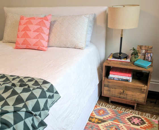
My full piece is here, but I’m pulling the main shots below as they’re a good sampling of new updates I’ve made at home.

I made some edits to the bedroom, but it wasn’t about dramatic changes, rather the small changes that make a huge difference, showing what happens when you swap in new colors and textures.  And while bedrooms are often places of serenity and neutral colors (ie white and white!) that’s just not me. Best Bed

Enter:  new graphic rug!  It’s amazing what a small piece can do to bring in new energy.   I fell in love with this little 3×5′ number from Urban Outfitters that was initially for my kitchen, with it’s cheery pattern and mix off-base colors.  But once I placed it between my nightstand and red dresser, bingo – it found it’s rightful home.

I pulled pinks and teals from the rug to accent the bed and nightstand, then the natural domino-effect occurred and the whole exercise found me repainting the walls – from taupe to a barely there gray – and restyling my bookshelf.

For the bookshelf task, I had to start is from scratch.  They say (ok, my mom says…) that sometimes you stop seeing what’s right in front of you once it’s been there for awhile.  This meant clearing everything off and gathering my accessories – from my bedroom and beyond – into one pile.  (Guesses on my favorite colors??)

I built vignettes on a few shelves, then left some white space for the eye to rest, working in warm brass and earthiness with the plants and wooden frame.  I then added sculptural items like the oversized jack and the succulent, to break the divide between the more horizontal lines of the shelf and the vertical pieces.

HH Shelf

The result feels clean, bright, edited.  And it truly impacts how I feel when get up each morning:  I’m a bit more focused, a bit more energized and ready for my day.

Sources:

Mirror: Rejuvenation.com
Dresser:  cb2
Bookshelf:  cb2
Bed:  ABC Home
Linens:  Parachute, Crate & Barrel, Linge Particulier, Anthropologie
Artwork:  Etsy
Lighting:  West Elm, Urban outfitters
Rug:  Dash and Albert (large), Urban outfitters (small)
Accent pillow:  John Robshaw
Throw:  Fern
Accessories:  Anthropologie, flea markets, etc.

More pics from ApartmentTherapy post:

AT 1AT - 2AT - 3AT - 4AT - 5

Kitchen Aspiration

Kitchen Final Option

In my quest to post “polished pieces” and final design projects on this blog , I’ve gone months without a peep.  This is nonsense!

So today I present you with something at its beginning:  my kitchen.  When I moved here 3 years ago, I was charmed by its age.  Plenty of apartments I looked at had sleekly renovated kitchens and modern cabinetry, but they left me cold.  This place was different:  its kitchen hadn’t gone through any changes in 30+ years – for better or for worse.

Kitchen Before 1

Its white wood cabinets are decorated with branch-like pulls that are quirky and actually quite charming.  And the layout is nice.  But it’s ripe for an overhaul, so here we are.  Enter my renderings:

20160814_182955

The best way for me to imagine my space is to put pencil to paper.  While digital drawing tools are great, drafting lets me work out a scheme more organically.  So after drafting a few designs and a rough 3D perspective, I used watercolors to work through the different color and material options.

Kitchen Sketch 1

Painting out four different versions allowed me to get a broad stroke visual of how materials like wood, white granite and dark vs. lighter cabinetry would read in the space and work together (or potentially against each other).

I alternated between white or wood counters, charcoal finished lower and upper cabinets, and white subway tile with antique brass pulls and accents.  The renderings are by no means polished; I got scrappier as I went, quickly getting the color on the page to see the effect.

This helped me visualize potential fixtures and materials, which all nicely bridge the gap between modern and classic, with a nod to industrialism.

So I’m close to a winner:  in lieu of going monochromatic, I’m opting for an eclectic look: dark cabinets on the bottom to tie the space in with the rest of the apartment, with white on top. I’ve also heard wood top counters are high maintenance, so I’ll bring in that look with reclaimed wood paneling around the island, or with porcelain wood tile as the backsplash.

Kitchen option 3

So it’s go time.  But not quite yet:  I’m trying to enjoy the feeling of having made decisions!  Sometimes that’s just as much fun as the execution.

But nothing will be as fun as sitting at a new counter for the first time, rendering something new.

Fantastic Plastic

Blue Record

Lady Soul, Aretha Franklin, 1968

If you know me even a little bit, you know I’m an old soul.  My Brooklyn apartment was built in 1849.  1849!  God only knows how many people walked these floors before me, the ghosts of 5 generations hanging out in my kitchen, drinking their ghost tea.  As my neighbor says, we’re merely caretakers of this building, before the next owners come along.

Deep, I know.  But I digress.  I meant to ruminate on the old soul thing.   I’m a nostalgic person.  I’ve always loved digging through my granny’s things, her albums with pics of my mom as a kid, and our family garage, bursting with my dad’s basketball paraphernalia.  Old stuff just lights me up, so it should come as no surprise that I bought a turntable.
I rented a house with friends in Venice this spring, and the owner had a great Audio Technica system.   We spun records all weekend, rediscovering anthems by The Velvet Underground and Bruce, sounding just like they were meant to.  We actually enjoyed flipping a record when it was time, often in the middle of a conversation.  That part wasn’t annoying, rather the opposite was true.  It reminded us that the music didn’t need to be the background of our evening:  it could be the star.
And it brought me back.  Growing up in the 80’s, my dad belonged to a record-of-the-month club.  As his collection grew, I developed a love for Doo-wop, Motown, early-60s Beatles, and The Rolling Stones.  Sticky Fingers was a favorite.  I remember my confusion with how the “fly” worked on the outer sleeve.  What was behind there?  (We could do a whole separate analysis on that one…another time.)
Fast-forward 30 years and I’m building my own collection, feeling the joy of discovering music.  Yes, we’ve come a long way with Spotify and the like, offering fast access to almost any tune.  But I’ve missed the hunt: digging through tapes and CDs at the Tower Records of my youth, discovering songs on iTunes, it’s all morphed into streaming music from a phone beamed to a speaker.  Convenient?  Yes.  But something is lost.  I miss committing to a full album, getting to know its nuances and its “sleepers”:  the songs that don’t hit you at first, but grow on you slowly until they take root. Pink Record
And lest we forget the physical, records are beautiful.  For someone who strives for a visually appealing space, this is not lost on me.  Take Lady Soul by Aretha Franklin.  When I play it, I get to eye the old Atlantic Records font on the pink and red sticker, and I swoon at how it looks against the curvy white turntable; beautiful.
And by chance, vendors are popping up everywhere.  On Sunday at at Brooklyn Flea, at the base of the Manhattan bridge, you can thumb through a huge assortment, each album marked with a sticker, featuring its own hand-written review by the vendor (“Wonderful; no skips!”)  You have to love that.
So yes, I’m on the bandwagon.  But the great spillover effect?  It’s helping me be more mindful, slowing me down so I can be in the moment and appreciate what I’m listening to, not pushing the forward button too quickly, letting what’s playing just, well, play.
20160329_181724

This is me…still figuring out where to put my turntable

So back to my recent finds: I picked up the below Beach Beats record while on the hunt with my friend Dani, who loves a good troll through the crates as much as I do.  I bought it because it had two 50’s songs I love.  But when I played it, I heard a song by The Coasters I hadn’t heard since hanging out in my 80’s living room.  I suddenly saw my dad jamming to the tune, whistling away, playing his fireplace broom like a guitar.
 Pink RecordWhat a memory.  And for clarity’s sake, my dad may has moved into the 21st century of music, beaming his songs via bluetooth to his wireless speakers (call it a role reversal).  But it does nothing to erase the warm memory I have of that music, its scratchiness, the way it would boom through our house, and the way it felt to do nothing…but listen.

The Joys of Unplanned Time

Radishes 1.jpg

Radishes, 2016

There’s nothing like a city snowstorm to really slow you down, in a good way.  This piece over the weekend said it best: blizzards have a way of punishing the ambitious and rewarding indolence.

I took the cue and planned my own un-planned weekend (yes, I understand the irony here), starting with an old-fashioned sleepover with two of my closest girlfriends.  Our agenda items: 1) wear sweatpants 2) be cozy in said sweatpant, 3) catch up with each other. (Carbs and Moscow Mules may/may not have been involved).

So you’re wondering about the above radishes?  Well, when the girls left on Saturday to avoid a snow-in situation, I took to my watercolors, facing hours of (yay!) time at home.

I returned to watercoloring this past year as a way of practicing my rendering, but also because I just really enjoy it.  Fast forward, and my little furniture studies have given way to winter veggies.  I started with a red onion, and while I still won’t eat them, I now I see them as beautiful, with just one of them showing several shades of some of the prettiest purples in nature.Red Onion
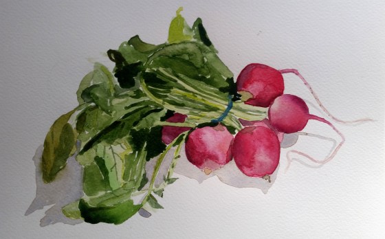
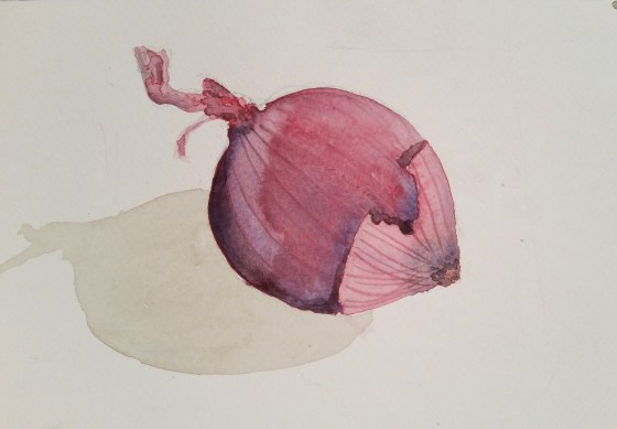
I moved on to sweet little bunches of baby carrots, then radishes, first putting down a light sketch before getting into the painting action.  Note:  time is not your friend when painting fresh produce (I now know).  These puppies will wilt and change in front of your eyes if you don’t paint fast enough – a lesson in decisiveness and speed, both essential when watercoloring, which rewards both.Carrott Vignette

I’ve learned that painting, for me, isn’t about filling up free time with a hobby.  “Totally” free time can be hard to come by when most days are composed of working, playing, learning, schooling, commuting, socializing, chore-ing, errand-running…and so on.  So for me, it’s quite the opposite:  painting is about loving something so much that I carve out the time to do it, often casting aside my to-do list in order to spend an hour or two brush-to-paper.  So I chose to enjoy the swaths of free hours this weekend at home.  While many of us were inconvenienced, I was – in fact – convenienced*.  Lucky me.Carrot Comparrison


*not a real word

Waking up a Dull Corner

IMG_2461When you’ve been living in a place for a year plus, some of the details that you found unbearable at first seem “not so bad” after awhile.  I definitely experienced this (hello, 100-year-old rusty bathroom heater!)  That’s how I felt about this corner of my living room.

To be fair, the before picture is from the previous tenants.  But I think some of my recent updates have transformed this nook into a happier little enclave.

IMG_2451

after

This area had some nice things going for it:  built-ins on the north wall to the left, a nice cool gray wall color (Natural Grey by Behr), but based on pure apartment functionality, it was overcome by wires and power chords, not to mention my smallish (aka “man poison”) TV.  And for the past year I’d been using this Pottery Barn apothecary coffee table (below) as a console.

Apothecary Table

It’s a gem my sister passed along 9 years ago when she departed the city for the burbs.  It packs a punch and has served me well over the years, storing everything from a collection of clutches, iPod chargers, playing cards, old passports, and nail polish (you sensing a slice of my extra-curriculars?)  And I sadly have to let it go.  I’ve swapped it out for this West Elm console.  Predictable?  Yes.  But there’s a certain originality to this piece:  the shape is industrial but not cold, warmed up by the varying tones of wood.

I also needed to fire up the walls.  I had purchased this Gray Malin photo a few months ago and just had it framed.  I worked with the guys at Make a Frame in Cobble Hill.  They did an awesome job, and helped me choose a light maple frame and bright white matte.  And while I had to remove my death grip on my wallet to pay for it, it was worth it.

The photo itself speaks to my love of symmetry:  the umbrellas strike a nice repetition, and the pinks liven up the living room, so much so that I felt the need to add a pink-striped sarong (really!) from Anthropologie as a stand-in throw blanket on the gray chair.  Lesson here:  even clothing can be an accessory given the right context.

Screen Shot 2014-08-17 at 7.24.42 PM

Some other upgrades:  adding a tree.  I chose a fiddle leaf fig with big, glossy leaves, in an effort to bring the eye up and take advantage of some of the apartment’s vertical space.  I’d really love to keep this one alive.  (Apparently you need to “dust” your plants and give the leaves regular care, just as important as watering.  Who knew).

I also found a solution for those unruly wires.  This framed blow-up poster from a page out of Gourmet magazine makes a great shield that covers the mess, and it’s lightweight enough to be moved around when needed.

IMG_2423

Some light accessorizing rounded out the project.  The console needed color, so I pulled in a potted oregano plant and a green seltzer bottle to pick up the shiny tree leaves, fitting them snugly in a simple white tray.  Some trivia: the bottle was $18 at my local Housing Works thrift shop, presumably on sale since it’s chipped on the bottom.  #nobigwhoop  Score!

IMG_2454

IMG_2457

I’m happy with the nook.  It’s a treat for the eyes, and my changes added some nice storage too.

As for the man poison?  I think my TV will remain a humble 26″.  I’m still looking for this guy, if you know where I can find him….

Trimming Your…Walls

20141214_224946 (1)Well, then.  We can just about tie a bow on this year.   Could that be right?   If the sidewalks of New York are any indicator, it feels holiday-ish for sure. There’s a frenetic vibe on the streets, and I can feel peoples’ paces quicken as they hurry to get stuff done.  I’m no different.  I love a good garland hunt, hanging lights, and an afternoon in the kitchen where I can bang out some sugar cookie dough and roll out my gingerbread men (“bite me!”)

It’s also a nice time to reflect and take stock.  Sitting here with my lovely little stump of a tree (couldn’t resist showing you my 3-foot charmer) I’m reminded that things have come together in my home this past year.

20141213_171218 (2)

One of my long-term projects has been finding art for my walls.  This area in particular, above my console, was screaming for a gallery-like composition.  But I didn’t want to rush it, nor did I want it to feel too cookie-cutter.

It’s finally taken shape with the help of some good – and practical – sources.  And while I’m all about investing in original pieces that last a lifetime, it’s not always reasonable (hello, mortgage!)  So I’ve corralled them below if you’re embarking on your own personal gallery mission. Enjoy!

Brooklyn Flea

20141214_102311 (1)

Transistor Radio by Michelle Han

This place always delivers.  The original Brooklyn Flea was set in Dumbo, and back before Brooklyn exploded, they were more focused on antique-y type dealers.  Now they’re full-fledged productions with even more space for hipsters and horticulturalists to peddle hand-made jewelry and artisanal honey.  Once in awhile you’ll find a pop-up Flea, like I did last fall in Park Slope, so it pays to scope out different neighborhoods.  I was happy to stumble upon this piece by Michelle Han, a local Brooklyn printmaker:  not only do I love the hand-carved quality of this print, but I love music and tend to get nostalgic for the days before we streamed everything.  So this makes me smile each time I see it.  14″ x 17″ Wood Gallery Frame by Pottery Barn.

Etsy:

For those of you not in the NYC area, Etsy has a huge range of art, from hand-screened prints, original paintings and custom work.  I purchased this bike print a few years ago (which is why I sadly don’t recall the name of the Etsy store), but I love it.  And framing it was an exercise in recycling:  I found a great frame at a yard sale and ditched the previous owners’ oil painting.

Then I “float-mounted” my new print on piece of charcoal gray paper so as to stay in step with my color scheme.  (I’ll revisit some more framing tricks in another post).  I think the dark background helps highlight the print.

Union Square

On Saturdays in Union Square, you can find loads of artists selling their wares.  This is my third piece from a photographer I met there, Matt Schwartz.  He creates his pieces from actual Polaroids, peeling away thin layers to give them an aged effect.

Yellowdress

Consider his work a precursor to Instagram.  You can find him online at SheHitPause studios.

Fab.com

While their selection is varied (read: hit or miss), they’ve got some gems.   From their series of map line drawings, I chose this Florence map, and it brings back nice memories.  Florence is the first place I ever traveled alone outside the states, and it reminds me of the many miles I walked.  For some reason, this seems a much better tribute to those two weeks, versus even the best framed photo I could have ever taken.

Florence

Etching, Map of Florence

One Kings Lane

LA-based photographer Gray Malin takes fantastic travel and aerial photography.  I found this aerial shot of a Miami beach on One Kings Lane, but you can go right to the source as well at graymalin.com.   I loved the accidental repetition of the umbrella shadows, and went large-scale with this one to hang solo on a separate wall.  I’m having this puppy framed up nice…ie, custom.  #happybirthdaytome  Check back to see how it turns out.

Screen Shot 2014-08-17 at 7.24.42 PM

Speaking of framing, I have some favorite sources there too:  AI Friedman, Ikea, CB2 and Pottery Barn – all make great quality frames in loads of sizes.  And while its tempting to order standard frames that match, it was even more satisfying to incorporate hand-me-downs and flea market frames that lend a nice a patina and sense of originality.

And just to make sure I had something original, I framed one of my practice watercolors from class.  It’s nowhere near perfect, but it’s a happy little piece, and it reminds me that some of my favorite pieces have no price at all.

20141102_132433 (2) (1)

Settee, 2012