Winner!
Ever struggled with writers’ block? I think I have the designing equivalent.
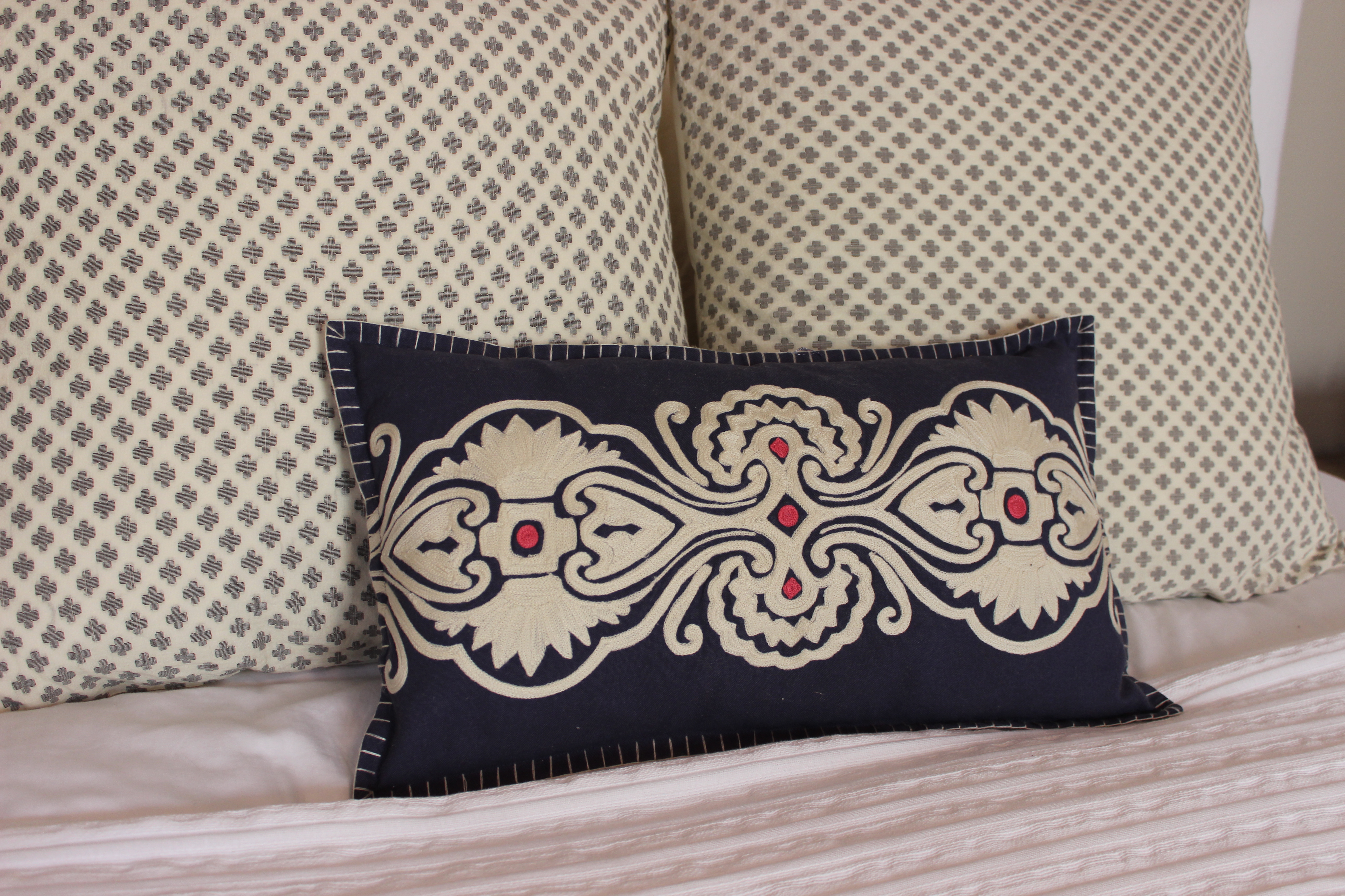
It’s my master bedroom (sidenote: can I rename it? Being “master” of your household feels odd when you’re the only one in it.) This room has been feeling pretty basic since I moved in. It’s got a nice bed, solid white bedding, and good floors. But each time I try to accessorize it with teal, green and coral colors, they fall flat and clash with the walls that, lately, seem more khaki than the gray I was aiming for (I’m not a fan of khaki but I’m #alreadycommitted). Enter: slate blue. Blue isn’t in my apartment’s color palette aside from the turquoise I have sprinkled about. To me, classic blues have always felt safe, nautical, preppy. All great, but not the feeling my space evokes. But slate blue seems to take on a new feeling.
With another successful trip to Housing Works, I found this wonderful pillow cover amid a stack of designer samples. I love the embroidery and the pink accents. As with many items I find without price tags, I played that game “what’s it worth to me?” I came up with $15-$20, the price I’d be willing to pay once I got to the register. If it was anything more, I walk.
Drumroll…it was $2! Once home, I stuffed the cover with a castoff pillow I was tired of, and sure enough it did wonders to wake up my room. The walls sang, the shams popped, and a new color palette revealed itself. Now all I need is a span of one uninterrupted week to paint an accent wall behind the bed. (A girl can dream…)
