Scalloped Accent Wall

IMG_2063

One of my goals this summer is to create an accent wall behind my headboard.  I’ve contemplated a scallop motif ever since I was inspired by this image from Design*Sponge of a teal scalloped bathroom tile:

Bathroom Title (Source:  Genevieve Gorder, as seen in "Design*Sponge"

Bathroom Title (Source: Genevieve Gorder, featured in “Design*Sponge”)

While I love the repetition of the shape, there’s something about the variation in color that appeals to me; it’s anything but flat.  I’ve since seen inspiration everywhere, and just designed something that’s in line with the scale of my wall.  It turns out, the scallop I’ve been attempting is actually just an arc repeated over and over.  After drafting a few versions, I’m opting for the pattern on the left:IMG_2080

As for creating a stencil out of my drawing, I’ll leave that tedious project for another (rainier!) day.  Stay tuned…

Shoe Storage Upgrade

In my scurry to move forward on new projects, I’ve been remiss in posting some of the nice little moments that have come together in my apartment.  One of my favorite nooks is this one by my front door.  It’s a chair + crate combo that’s nice on the eyes, and also holds and conceals my shoes.

IMG_1893

The chair is CB2, and the wood crate is a find from Maine during a drive home from my friend Kim’s wedding.  A few of us stopped by some antique stores in Wells, and I founds this Hood Dairy crate for $28.  It dates back to…well, I’m not sure.  But it’s old.  And I was drawn to its red check pattern, and of course its crustiness.  I think this montage is a good reminder that mixing old and new is easy, as long as you can find the similarities that tie the pieces together.  In this case, the red tones do the job.  I may add wheels or sliders, TBD.

20140622_162929

OH and my friend Silvia scored a mink that day and we got a $20 discount for paying cash and bundling our purchases.  wooo! #effectivenegotiation


Fun with Seedlings

IMG_1442

I had a full summer in my place last year, so I had some time to try my hand at gardening.  I learned a few things, including the benefits of watering plants at night (do it) and that I’m terrible at growing roma tomatoes (I have no idea why).  Most exciting though was learning what I could grow and benefit from on a daily basis, like summer salad add-ons, like mint, basil and cherry tomatoes.

All well and good.  But this time I’m venturing a bit further into veggies, in addition to planting some classic potato vines and impatiens.  I picked today of all days to do so…not ideal given I leave for a 2 weeks in exactly 3 hours.  (I’ve have always done my best work under pressure).  Here’s what I opted for (UPDATED to reflect 2 weeks of growth).  Note the handy watering “picks” I found on Amazon; you just screw them to the top of a used soda bottle.  Or in my case…sacrificial tonic:

Before:

IMG_1446

Radish plantings from seed

After:

IMG_1861

Radish plantings from seed

Before:

IMG_1449

Mixed impatiens

After:

IMG_1868

Mixed impatiens

Before:

IMG_1445

Cherry tomato seedlings

After:

IMG_1862

Cherry tomato seedlings

IMG_1865

First tomato of the season

Small Details, Big Impact

Winner

Winner!

Ever struggled with writers’ block?  I think I have the designing equivalent.

It’s my master bedroom (sidenote: can I rename it?  Being “master” of your household feels odd when you’re the only one in it.)  This room has been feeling pretty basic since I moved in.  It’s got a nice bed, solid white bedding, and good floors.  But each time I try to accessorize it with teal, green and coral colors, they fall flat and clash with the walls that, lately, seem more khaki than the gray I was aiming for (I’m not a fan of khaki but I’m #alreadycommitted).  Enter: slate blue.  Blue isn’t in my apartment’s color palette aside from the turquoise I have sprinkled about.  To me, classic blues have always felt safe, nautical, preppy.  All great, but not the feeling my space evokes.  But slate blue seems to take on a new feeling.

With another successful trip to Housing Works, I found this wonderful pillow cover amid a stack of designer samples.  I love the embroidery and the pink accents.  As with many items I find without price tags, I played that game “what’s it worth to me?”  I came up with $15-$20, the price I’d be willing to pay once I got to the register.  If it was anything more, I walk.

Drumroll…it was $2!  Once home, I stuffed the cover with a castoff pillow I was tired of, and sure enough it did wonders to wake up my room.  The walls sang, the shams popped, and a new color palette revealed itself.  Now all I need is a span of one uninterrupted week to paint an accent wall behind the bed.  (A girl can dream…)

Curtain Contemplation

This gallery contains 3 photos.

My weekend mission: throw some weight into sprucing up the guest bedroom.   It’s funny…the smallest space in my apartment is actually the one I adore the most, with its dark walls and close quarters.  I’ve established a solid palette:  charcoal … Continue reading

Holiday House NYC

Academy Mansion

Academy Mansion

I had a chance to check out Holiday House NYC this weekend, an annual benefit to raise money for the Breast Cancer Research Foundation.  The event was held in an old mansion on the Upper West Side.  I volunteered through my school and had pretty sweet access to the rooms on display.

While the rooms were  fabulously done (more below) the old soul in me was fascinated by building itself, The Academy Mansion (aka Ziegler House) and it’s been vacant for 8+ years.  No one lives there!  Once a year, it’s brought back to its shiny self by a team of 12 designers who each take a room and put their own stamp on it.  I came away with some good nuggets of inspiration.  Here are some of my favorites.

This Living Room, by J. Cohler Mason Design.  I love the clean lines and the way the draperies draw the eye up to the ceiling that’s wallpapered in a glossy black snakeskin print.  Sexy!

Living Room

Living Room

Not sure who designed the power room, but sometimes it’s the small rooms that pack the most punch.  I’m loving the wallpaper motif.  It’s reminiscent of a half moon pattern I’ve been thinking of painting behind my headboard in my bedroom.

Powder Room

Powder Room

Speaking of my bedroom accent wall project, I’ve been cataloging a few inspiration sources and recently spotted a similar pattern on a tube of lipstick at Sephora in Tarte’s Glamazon Lipstick, below.  Just shows that inspiration can come from anywhere.

Glamazon Lipstick by Tarte

Christmas Party Prep

Holiday Mantle

One of the best things about getting more space is having room for friends to visit.  I no longer need to rotate people from hallway to bathroom to dining table in the duration of an evening (I kid).  So I threw a small holiday gathering last night and it did double duty:  I got to host many friends at once and try my hand at some new appies, and it forced my butt into gear regarding much-needed design decisions.

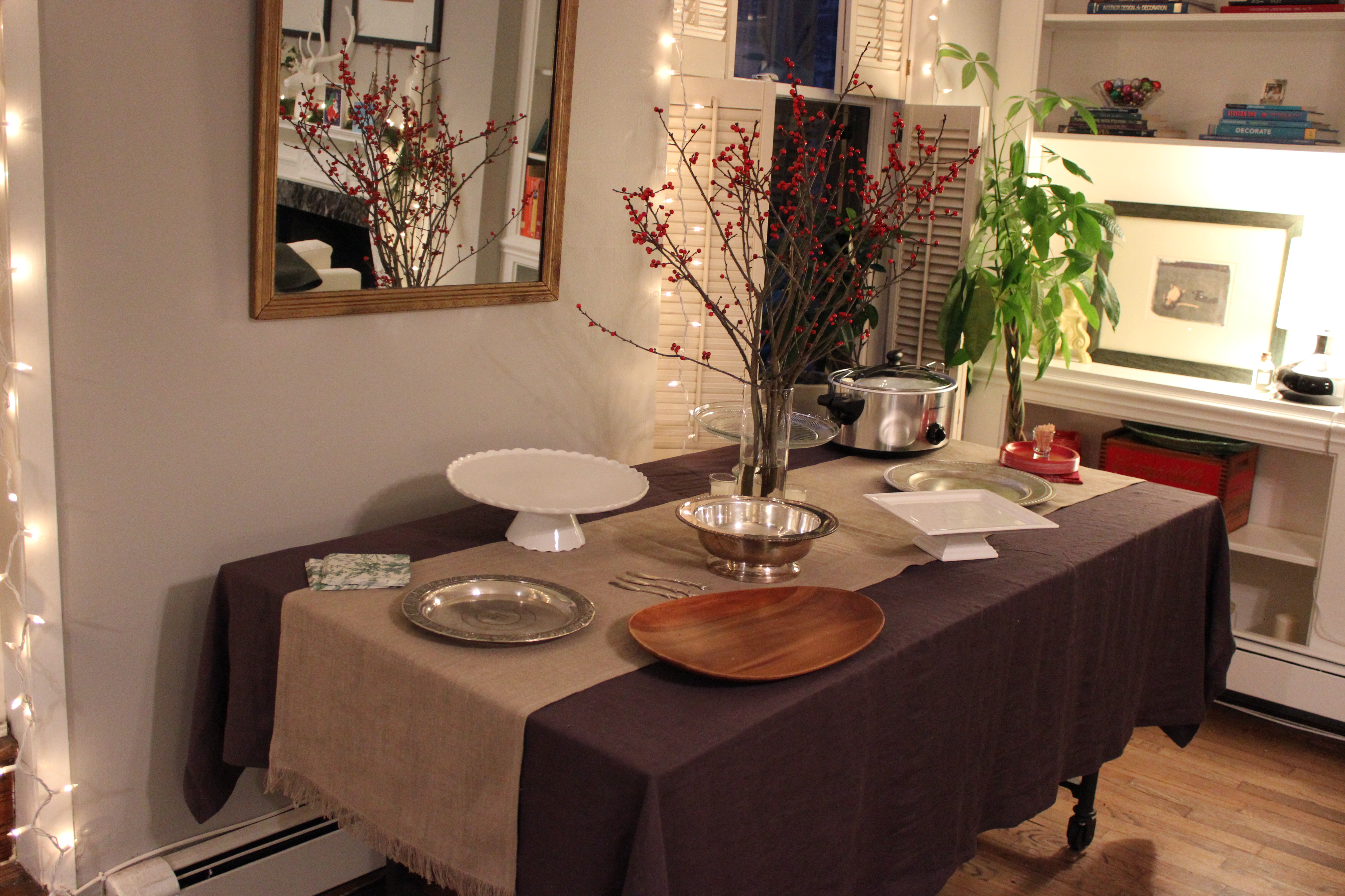
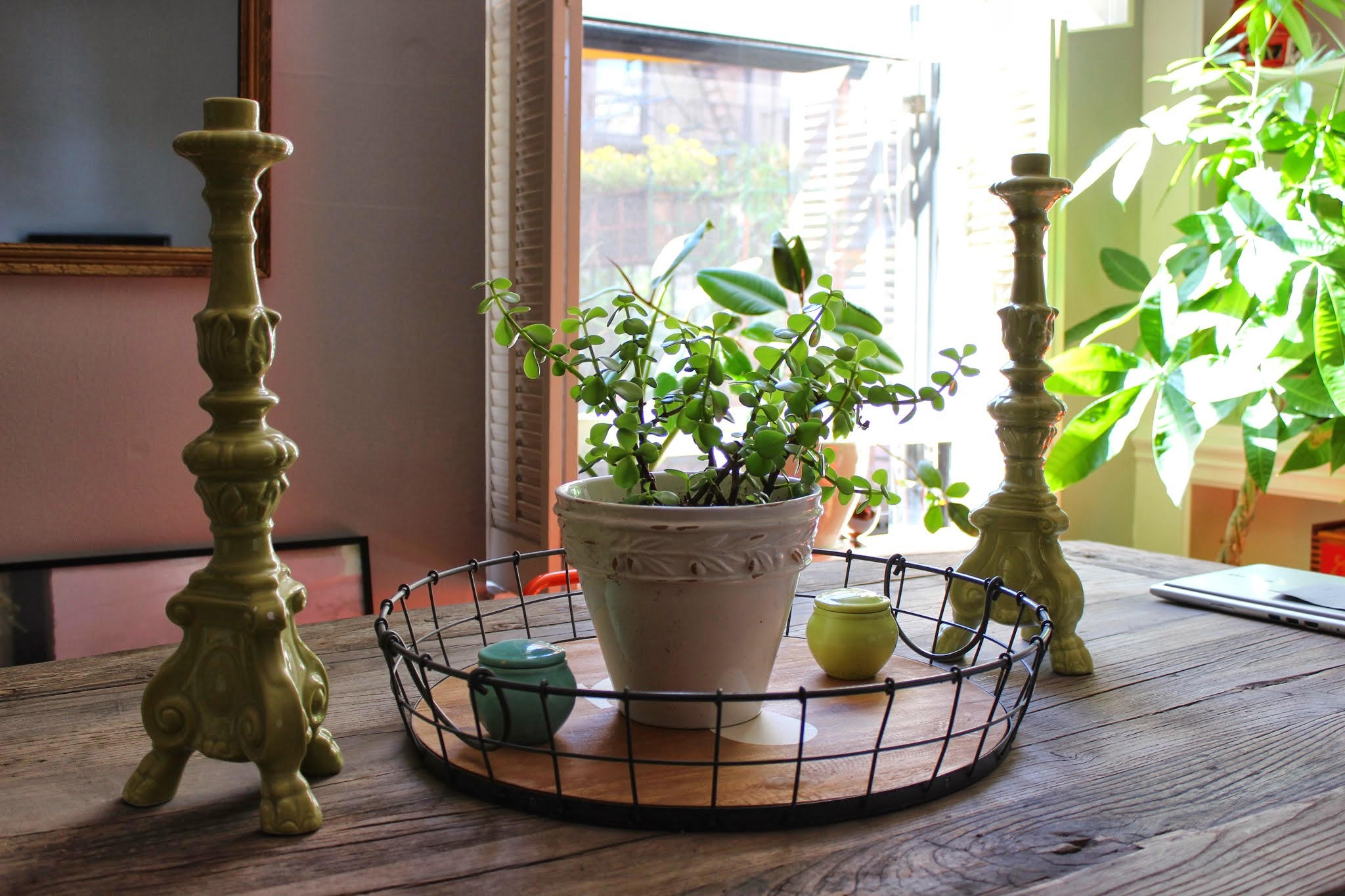
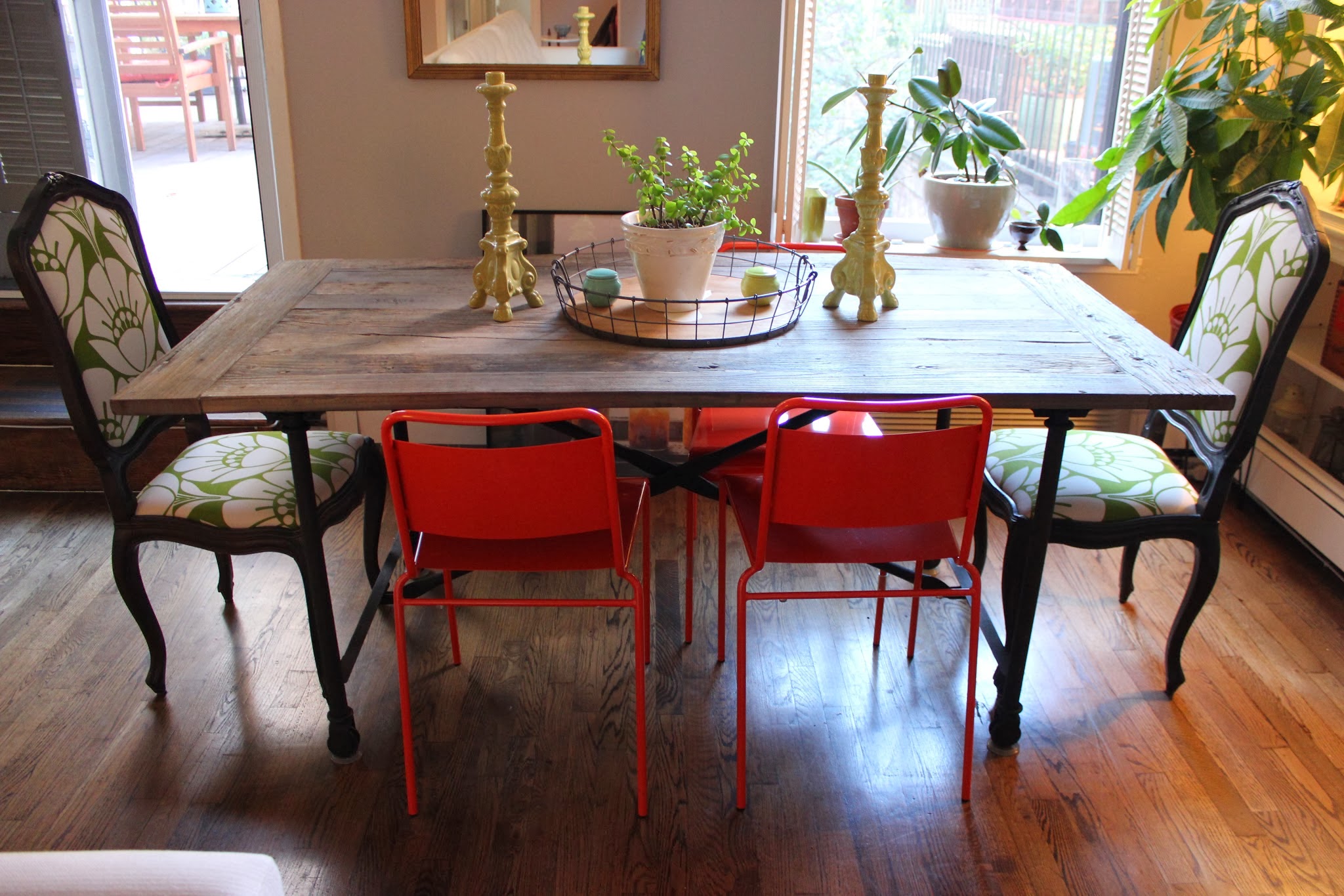
Fresh Direct – plus the fact that the liquor store delivers – made the food and drink part manageable.  For the food, I made everything.  Catering can be nice but I happen to love prep work.  I’m one of those people who fantasizes about piping deviled egg filling from a pastry bag into perfect swirls.  (If you haven’t tried it, it’s pretty gratifying). As for decor, my biggest mission was to make sure the living room was up to snuff.  This meant furniture re-arranging, garland-hanging, and committing to a carpet.

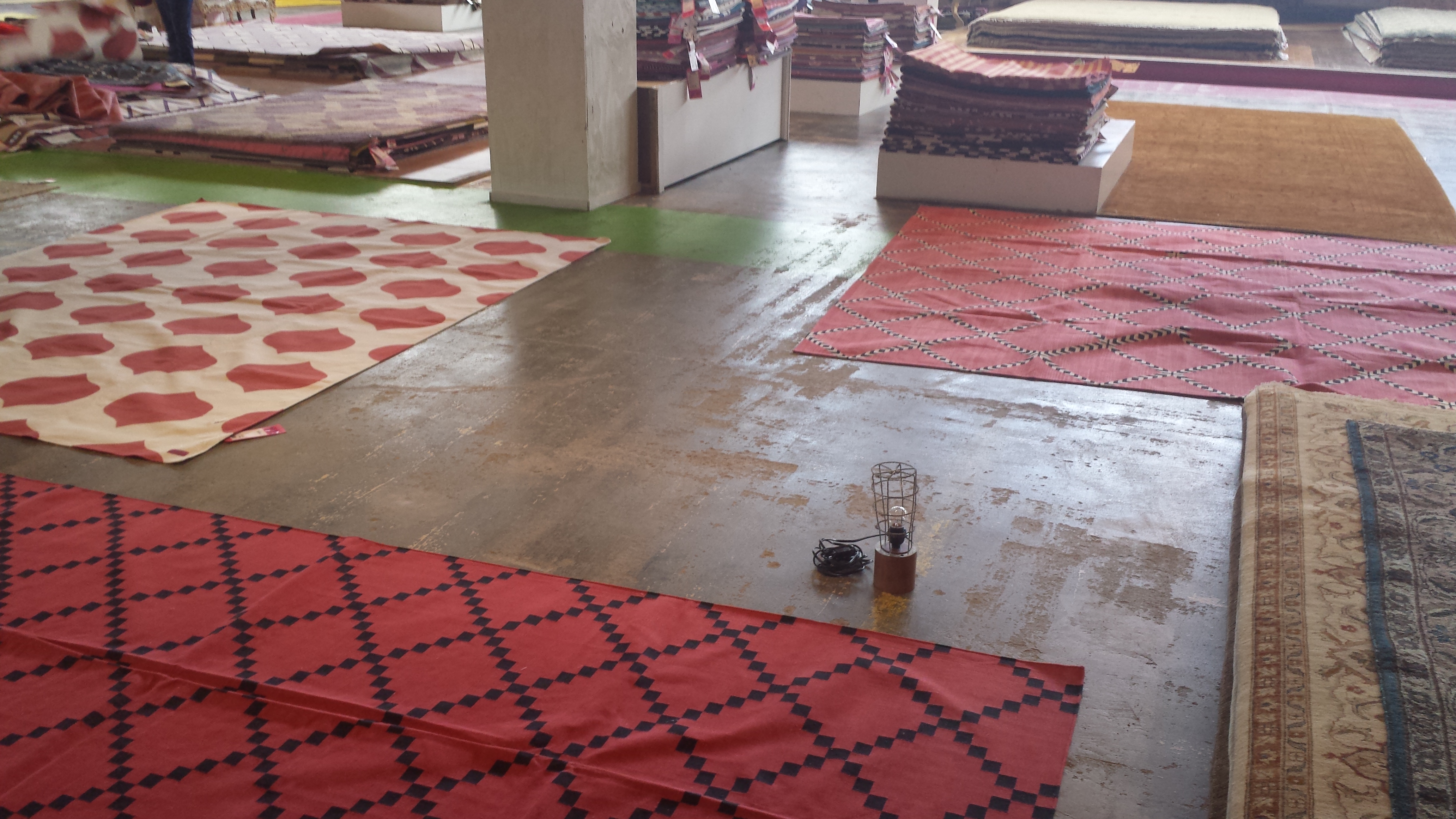
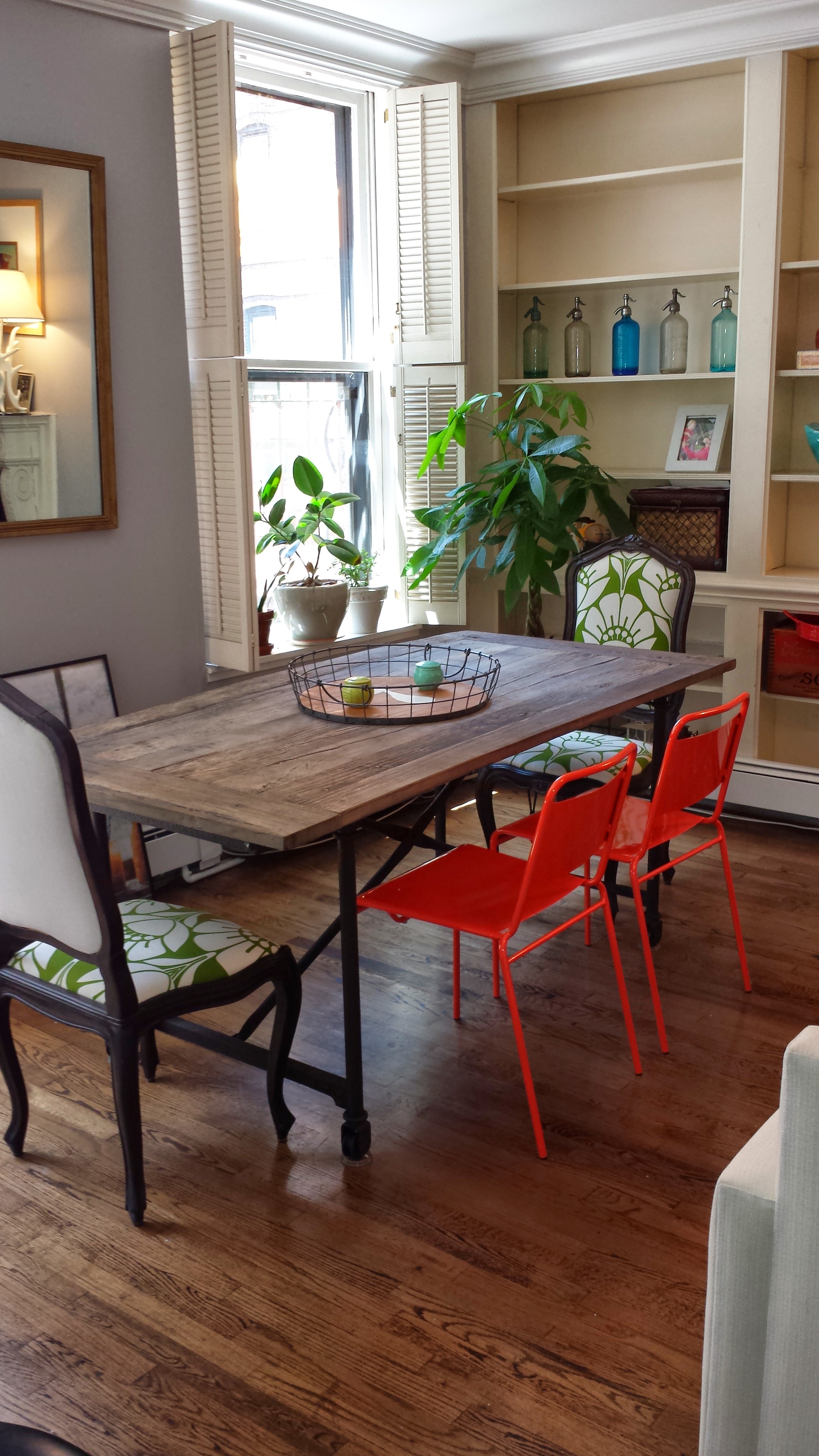
Ahhh commitment!  If you remember, I’d been searching for the right coral-toned rug for my living room.  But over time, I saw that there’s a lot going on visually in the space, and didn’t need more pattern on the floor.  Between the bookshelves and pops of color from my chairs, something more neutral would be easier on the eyes.

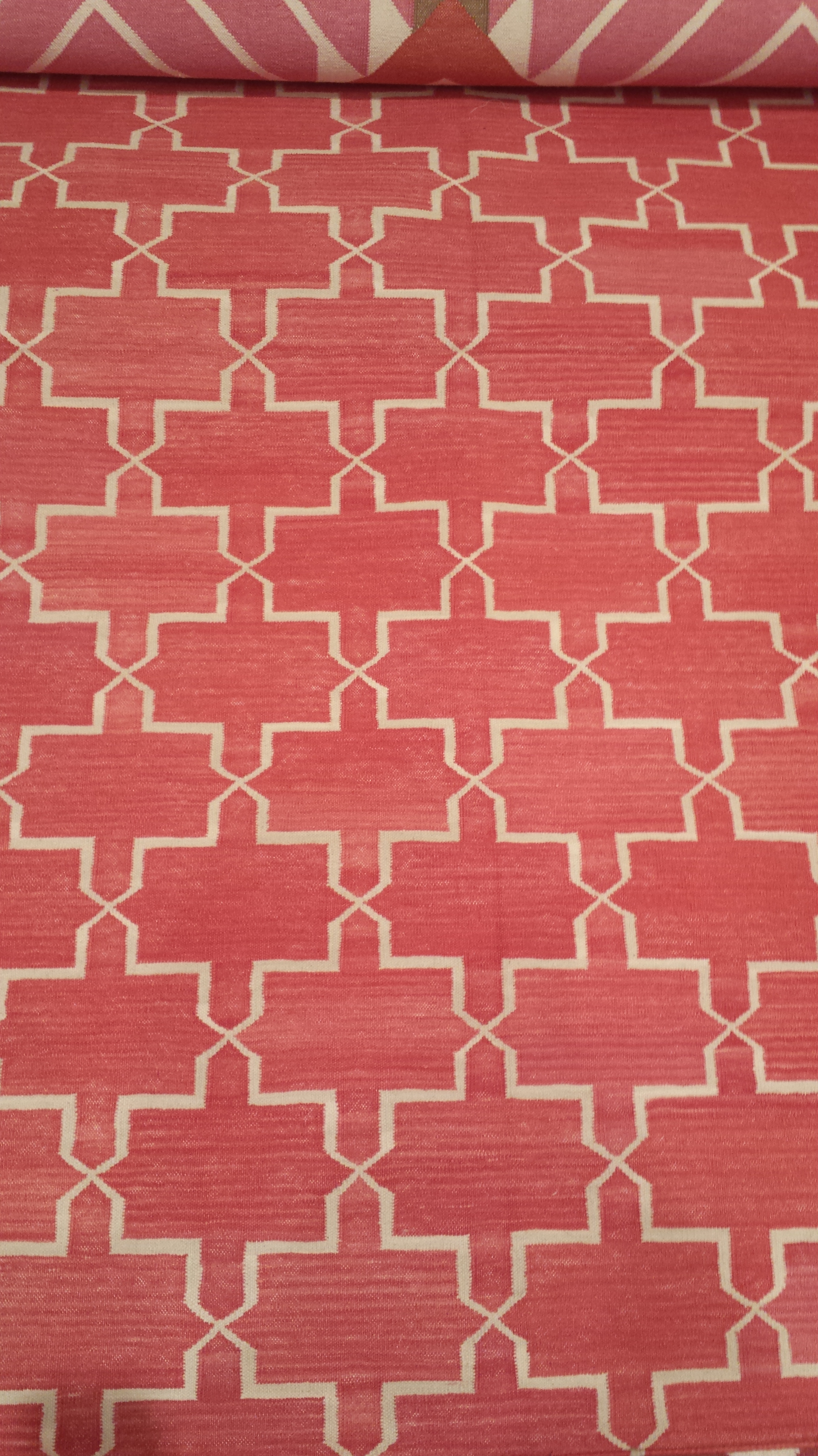
So my new pink rug I just picked up at ABC (and would love to use in another space) is, unfortunately, out:

Pink Carpet by Madeline Weinrib

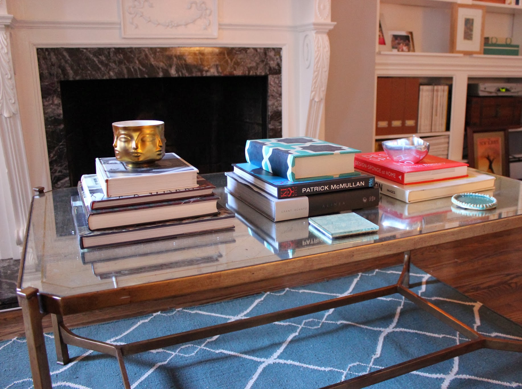
And this new gem from West Elm is IN:

Jute Rug in Platinum, by West Elm

I love it!   It lends a neutral backdrop yet still imparts some visual interest given its nubby texture and slight sheen.  And it feels surprisingly soft to the touch despite being made from jute.  And I have to say, West Elm has redeemed itself as a favorite retailer since my wobbly-full-bed-frame-purchase-of-2007.  Here are some more pics of the living room, pre-party.  I’ll refrain from showing any from the day after… : )

IMG_1298

I labeled the platters with Post-it notes about a minute after taking this pic.  (Yes, it’s extremely type-A.  My Aunt Jo would be so proud!)

Bar

Diversions: Neighborhood Jaunt

Some days I need to step back from making design decisions and feast my eyes on something other than fabrics and furniture sites and such.  Today I did just that.  A walk around the neighborhood reminded me of why I moved here.

Brownstones

Neighborhood brownstones

I love a good stoop.

View of downtown Manhattan from Brooklyn Heights

Brooklyn Bridge park

Brooklyn Bridge park

On a Mission: Carpeting

One of the lessons I’ve picked up about design schemes is to start with the floors, and work your way up from there to create a cohesive space.  Ie, find a good carpet that you love, and pull from it, letting it dictate the color palette and style of the room.

I was set on finding a coral carpet, the perfect shade of bright, “off red” that would complement my accessories and breathe life into the living room.  I had my heart set on the below Brooke pattern from Madeline Weinrib in Pink, but not only is it overpriced, the 8×10′ has been out of stock for awhile (probably a sign):

Brooke Carpet in Pink

So I just Zipcar-ed it out to the ABC Carpet & Home Warehouse this weekend in the Bronx and was blown away.  What a place.  It’s spilling with cast-offs from the pricier flagship store in the Flatiron, and there’s a full floor devoted to rugs.  Here are three frontrunners I pulled:

20130914_142019

They’re all close to what I’m looking for, but not close enough.  But they say those with an open mind are rewarded!  I found a cute lamp (on the floor, above) that’s already made its way onto a bookshelf:

ABC Lamp

…and a new coffee table as well.  A mirror-topped neoclassical shape that brings a strong masculinity to my space:

Coffee Table

You’ll notice it’s resting on my current carpet.  Babysteps..

Dining Decisions

Tablescape

Nothing would make me happier than rolling up my sleeves, donning some protective eye wear and constructing a wood farm table out of raw materials.  But I’ve come to terms with the fact that this won’t happen anytime soon.  Luckily there are great dining table choices out there , from the handmade variety on Etsy to the big box retailers.  I decided on something in between and chose this number from Restoration Hardware, the Flatiron Table with rust legs.  It’s made from a reclaimed elm door so it has a nice wear to it.

table and chairs

Kitchen table

When choosing my chair arrangement, I decided on a mix of old + new.   The bright powder-coated steel chairs are from CB2, and they pack a punch of color inside, and double as extra seating outside.  I’ve had the wood chairs with me for 7+ years.  They’re original finds from Housing Works that I stained and reupholstered in a simple printed fabric from Calico Corners.

My advice here:  don’t be afraid of mixing genres or styles, as long as there’s something that ties them together.  For me, the coral was an extension of a prevalent color theme I’d already established.  And the green chairs felt organic, pulling color from the plants inside and outside.  And I love both equally.  When you love an item, it will always work in your space.

I’m now a few steps closer to hosting Thanksgiving this year, and no longer fear having enough seating.  What I do fear is having a big eater make himself comfortable in one of my dainty wood chairs… #homeownsersinsurance  #thirdhelpings